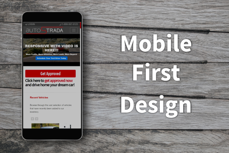
Mobile first design places prominent attention on the user experience for your mobile and tablet users, to make sure you can capitalize on all of your traffic and conversion opportunities.
Unlike old FLASH based and Fixed size websites that required expensive and labor intensive upkeep with a dedicated separate mobile website, a fully responsive website is the same website for all devices and simply adjust itself to fit all screen sizes. This makes sure that you communicate the same message, content, copy, video, and images to every customer at all times.
